Dis/inhibition: I have finished going through all the editor’s comments/edits, and tentatively chosen Lulu as my publishing platform. Now comes the job of formatting the manuscript and going through it one more time to check for stray issues. The covers are done, and this is the one I am probably going to go with. Next up, I want to design a small promotional website for it, and I’ll need more illustrations for that.
New story: Finished up chapter 4 and sent it to the Sculptor. I already started poking at and organizing chapter 5, so now that is the new focus.
Published by Nancy E. Shaffer
NANCY E. SHAFFER has been an experimental psychologist (M.A., Cognitive Psychology, Rice University), a philosopher (Ph.D., History and Philosophy of Science, University of California, Davis), and software developer. She taught history and philosophy of science at Concordia University in Montreal, Quebec and the University of Nebraska Omaha.
Her philosophical work has appeared in the journal Philosophy of Science and her pop-culture philosophy website, All Things Philosophical on Buffy the Vampire Slayer and Angel: the Series.
Dis/inhbition is her first novel.
She currently resides in Tempe, Arizona.
View all posts by Nancy E. Shaffer

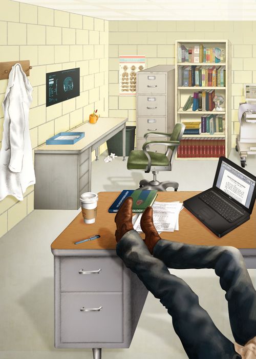
Oh God! That cover looks uncomfortably like one of my old dorm rooms. ;o)
It’s supposed to. It’s a graduate student office.
That cover has a very casual fun feel to it. I like the colouring too!
Yes, I knew it was an office. My graduate office was a lot more crowded but a couple generations newer.
That’s the starting image. I may attenuate it a bit so that it isn’t the entirety of the cover (and I have room for title/author info!) and the image is softened a bit. But I don’t want to lose the “attitude” in the legs.
Hee! That makes me scared, since this is supposed to be a contemporary story.
Graduate student office decor depends upon the $$s at the school you are attending. I wouldn’t worry too much. Plus the coffee cup gives it a modern feel.
This is typical of the budgets of places I went, LOL.
that’s an interesting cover. good luck
Thanks.
If the artist could add a little height to the walls, they might make a good background for title/author (maybe w/”Dis” along 1 wall & “Inhibition” along the other, w/the angle of the corner btwn. them serving as the slash, or even putting the words at an angle so the vertical line of the corner is slanted relative to them?).
I’m curious about the poster over the desk against the left wall. It looks like something astronomical to me, but maybe that’s just because of my interest in that subject.
It’s an MRI film image (of the human brain).
Oh! Yeah, that makes sense. Esp. w/the book on the other desk, which after enlarging looks like it’s titled Neuropsychology.